
The wallpaper, flooring and soft furnishings worth your money this year, and the costly mistakes to skip
So, what’s new in the world of interior design when it comes to choosing colors and furnishings for your home? Gray is out, and this is old news by summer. Personality is back in style. After a decade of stripped-back, white-box, "quiet luxury" rooms that all looked the same, people want homes with warmth, texture and a bit of soul. The biggest trends are warm neutrals, layered lighting, natural materials, sculptural furniture, and homes that feel collected rather than overly matched. The interesting part is how differently France and the UK get there.
Two personalities, same warm direction
I've spent the last 6 months in France and I find our that frnech designers leans into romance and quiet grandeur and design is treated less as a decorating style and more as a way of life, blending classic elegance with modern comfort: symmetry, decorative moldings, mirrors, fireplaces, round wooden tables and candlelight. What is fresh for 2026 is that the old ateliers are modernising it.
At Paris Design Week, historic French workshops known for boiserie and decorative arts are applying their craft to cleaner, more sculptural, bolder forms, producing a kind of refined modern opulence where centuries-old craftsmanship is reimagined rather than copied. And colour has gotten braver. Rich, saturated colours and boldly scaled patterns were everywhere across the Paris textile halls, with neutrals now used to frame those vivid moments rather than define the room.
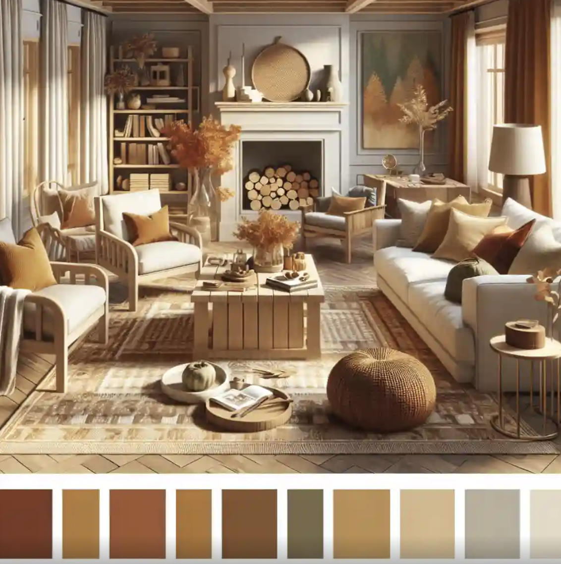
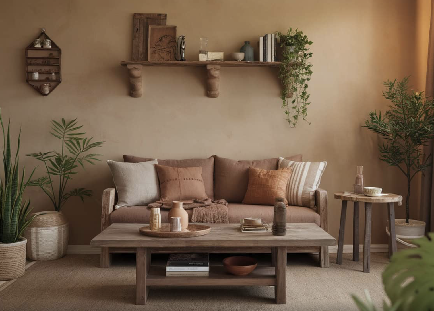
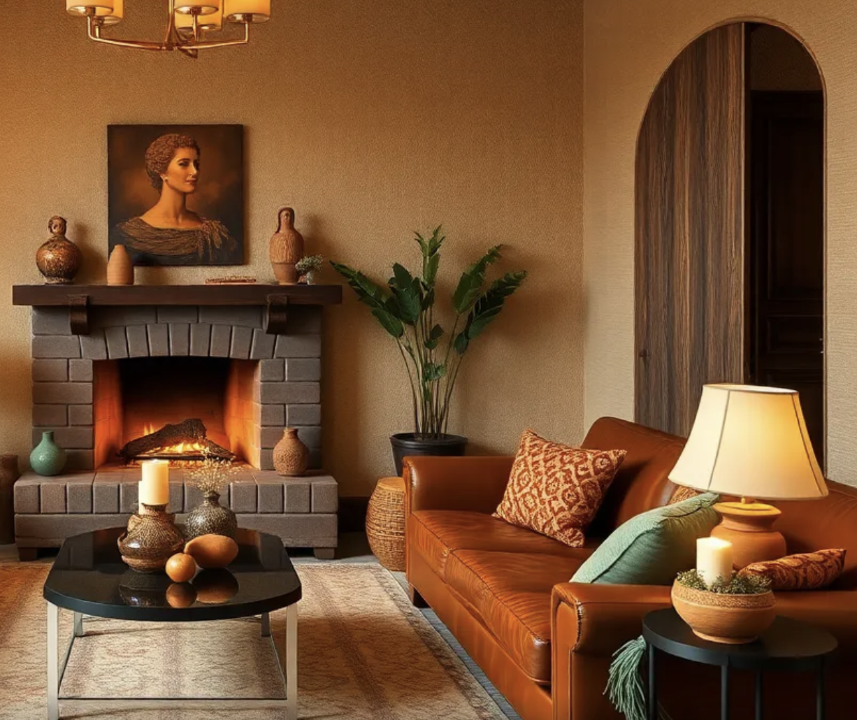
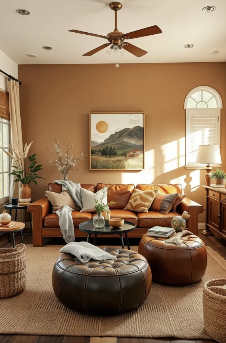
The UK takes the same warmth somewhere cosier and more characterful. Cool greys are out; deep earthy tones like taupe, warm stone, moss green, burgundy and brown create calm, inviting spaces. The British version is about a home that looks lived-in and personal. Mixing old and new pieces adds charm and individuality, and personal storytelling is treated as the real luxury. One thing worth knowing if you sell into this market: the British buyer is cautious with money right now. Interior design in 2026 is about beauty, but it is also about usability; homeowners want design decisions that feel worthwhile and rooms that solve real problems.
A shared headline across both countries is "colour drenching," where one rich colour covers walls, ceiling, trim and sometimes furniture. Saturated walls, ceilings, trims and upholstery create immersive, mood-driven rooms, and the trend stays strong into 2026. On the gentler end, burgundy and chocolate brown are still favoured, but softer hues are coming into focus: butter yellow, cornflower blue, baby pink and pistachio.
Wallpaper
This is the comeback story of the year, and it is good news for anyone in the wallcoverings business. Wallpaper is hot, with designers saying they will cover entire rooms in it, including the ceiling. The mindset has shifted. Wallpaper is now viewed not as decoration but as a tool for creating immersive, tactile spaces, which signals a real change in how people approach interiors rather than a short fashion cycle.
Three directions are worth showing:
Texture you can almost feel. Textured wallpaper that looks like linen, suede, grasscloth or plaster is very popular in 2026; it adds depth, feels warm and calm under soft light, and hides small marks in busy homes. Linen, sisal and wood-veneer papers also subtly improve the acoustics of a room.
Heritage florals and botanicals, reimagined. Not the bright jungle prints of a few years ago. The botanical look is moving toward subdued colours and refined detail reminiscent of classic tapestries, with forest scenes, large flowers and leaf motifs that feel handcrafted and lived-in. Heritage-inspired florals and botanical illustrations have seen sustained demand with no sign of slowing. This is where the UK's love of Morris and Sanderson prints sits naturally.
Pattern is back, but softer. Stripes are back with more variation and detail, and checks are returning too, adding class to a room; a good trick is pairing vertical stripes with wainscoting below.
The single most useful tip: when mixing patterns, keep one shared colour or tone so they feel like they belong together, and start with one statement wall before adding a softer pattern elsewhere.
Decoration and furnishings
Furniture is getting softer in shape and richer in material. A moodier approach to wood is defining the year: burl, reeded textures, carved woods and hand-turned legs, with darker stains and expressive grain making a feature of the wood itself. Shapes are loosening up too, with curves and organic, sculptural silhouettes replacing hard straight lines.
A few easy, photogenic decoration moves that are very 2026:
Statement mirrors are being used to add dimension to a room, terracotta tiles are making a comeback, and decorative flooring with personality is in. Mirrors are the cheapest way for a non-pro to instantly lift a space and bounce light around.
Lighting as mood, not just light. Hidden LEDs, statement pendants and subtle accents create atmosphere while keeping a room practical. In France specifically, colour is being built into the light fixtures themselves, used as part of a fixture's identity to shift the tone and mood of a space.
The thread running through all of it is "collected, not matched." People are bored of the quiet-luxury look where everyone's home is identical, so 2026 is about reflecting personality through artwork, textiles and meaningful objects rather than buying into a single aesthetic.
Flooring
If you only remember one word for floors in 2026, it is herringbone. Herringbone and chevron patterns are no longer reserved for high-end historic homes; in 2026 they have gone mainstream across hardwood, engineered wood, vinyl, laminate and tile, helped by affordable pre-cut planks reaching mid-range budgets. Designers agree it is having a major moment because wood herringbone brings a strong sense of vintage European character to a home.
The colour and finish story mirrors the walls. Cool grey flooring is out; warm tones are surging, with honey oak, natural walnut, warm greige, caramel and terracotta defining the year, and even tile trending warmer with beige, greige and terracotta outselling grey for the first time in years. Glossy floors are also out; matte and natural-oil finishes, wire-brushed planks and hand-scraped woods bring texture, hide wear and offer better slip resistance.
Terracotta is back in a real way, bringing warmth, depth and natural character, especially in kitchens and hallways. If you want the look without the upkeep, terracotta-effect porcelain tiles capture the earthy tones without needing to be sealed or treated.
There is also a move toward floor-to-wall continuity, using the same material on floor and walls to create a seamless, immersive envelope, helped by large-format tiles that reduce grout lines.
Soft furnishings
This is where the warmth actually lands, because it is the layer you touch. The defining word is texture. For the first time, Etsy named a Texture of the Year, washed linen, described as capturing quiet luxury without the fuss, while bouclé, corduroy and velvet keep the tactile, soft-to-touch trend going. The 2026 palette for fabrics is burnt terracotta, olive and moss greens, deep clay, muted mineral blues and warm sand and oat tones, layered through upholstery, drapery and cushions for a cocooning warmth.
On curtains, which matter most for window-furnishing folks:
The shift away from cold minimalism is driving demand for textured fabrics, natural fibres and layered window treatments, with soft linen curtains, pinch pleats and wave headings becoming more popular. Tailored headers are back, with the pinch pleat, especially the double or Euro pleat, making a strong comeback. Curtain pelmets are returning too.
Two thoughts worth flagging:
Layering. Pairing a breezy translucent sheer with a heavy velvet or lined blackout drape gives soft diffused light by day and full privacy and darkness at night, ideal for bedrooms. Velvet continues but with a 2026 update of deeper colours, matte finishes and better durability, often used as an accent rather than the mainstay.
Coordination. Matching curtain fabric to adjacent elements like the wallpaper, and coordinating headboards, cushions or lampshades, creates a cohesive, layered look rich in character. For cushions specifically, bouclé, waffle weave and chunky knits add tactile richness, refined geometric patterns add structure.
Useful to know: several wallpaper trends are being retired for 2026 in favour of natural textures, artisanal detail and more curated patterns. On floors, cool grey flooring now looks stark and chilly against the new warm palette, and large-format high-gloss porcelain tiles have outstayed their welcome.
Are you looking for a personal designer to transform your home into a unique and special space? Send me a message on PUBlish, and we can schedule a quick call to discuss your project.
