What should a made to measure blind calculator look like on a product page?

What should a made to measure blind calculator look like on a product page?
It should look like a good shop assistant, not like a spreadsheet. The customer types her width and drop first, the price appears straight away and updates with every choice, the fabrics are swatches she can click, the options are small pictures with plain words next to them, the measuring help sits inside the calculator instead of on a separate page, and there is a polite way out for the customer with twelve windows who is never going to buy a whole house on a website. Below are three ways to lay that out, all built on the same Curtain and Blind Calculator pricing engine on Shopify, because the pricing tables are the fixed part and the design is the part that changes from shop to shop.
Why does the design matter more than the price?
Because most people who put a made to measure blind in a basket never pay for it, and design is the reason more often than price. Baymard Institute keeps a running average of published cart abandonment studies and it sits at about 70 percent across e-commerce in general. For a custom product the drop-off starts earlier, before the basket, at the moment the customer is asked for a measurement and is not sure what she is being asked. A calculator that says "width" and "height" with two empty boxes and no picture loses her there. A calculator that shows the blind inside a window, labels the width on the picture, and puts "how to measure inside the recess" one click away keeps her.
The second reason is the price itself. A customer who has to email for a quote is comparing you against the shop that showed her the price in three seconds. Every layout below shows the price on the page, at every step, without a form and without a wait.
Style one: guided steps, size first
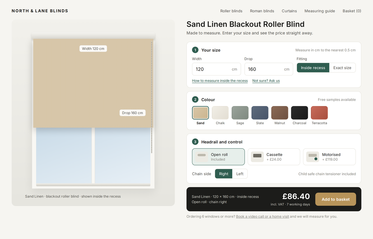
This is the layout we recommend for a first calculator. Three numbered steps, one card each, in the order the customer actually thinks: how big, what colour, what kind. The blind is drawn in the window on the left and the width and drop labels sit on the drawing, so a person who has never bought a blind understands which number is which. The price bar at the bottom repeats what she chose in words, "Sand Linen, 120 x 160 cm, inside recess, open roll, chain right", so the confirmation email holds no surprises. Under the price there is one line for the bigger project: six windows or more, book a video call or a home visit.
Note the small things a retailer would put in that a web designer would not. The fitting switch between inside recess and exact size. The hint that measurements are to the nearest half centimetre. The line about the child safe chain tensioner, because in the UK every corded blind sold for a home has to comply with the BS EN 13120 safety standard and customers do ask.
Style two: the compact product page, in inches
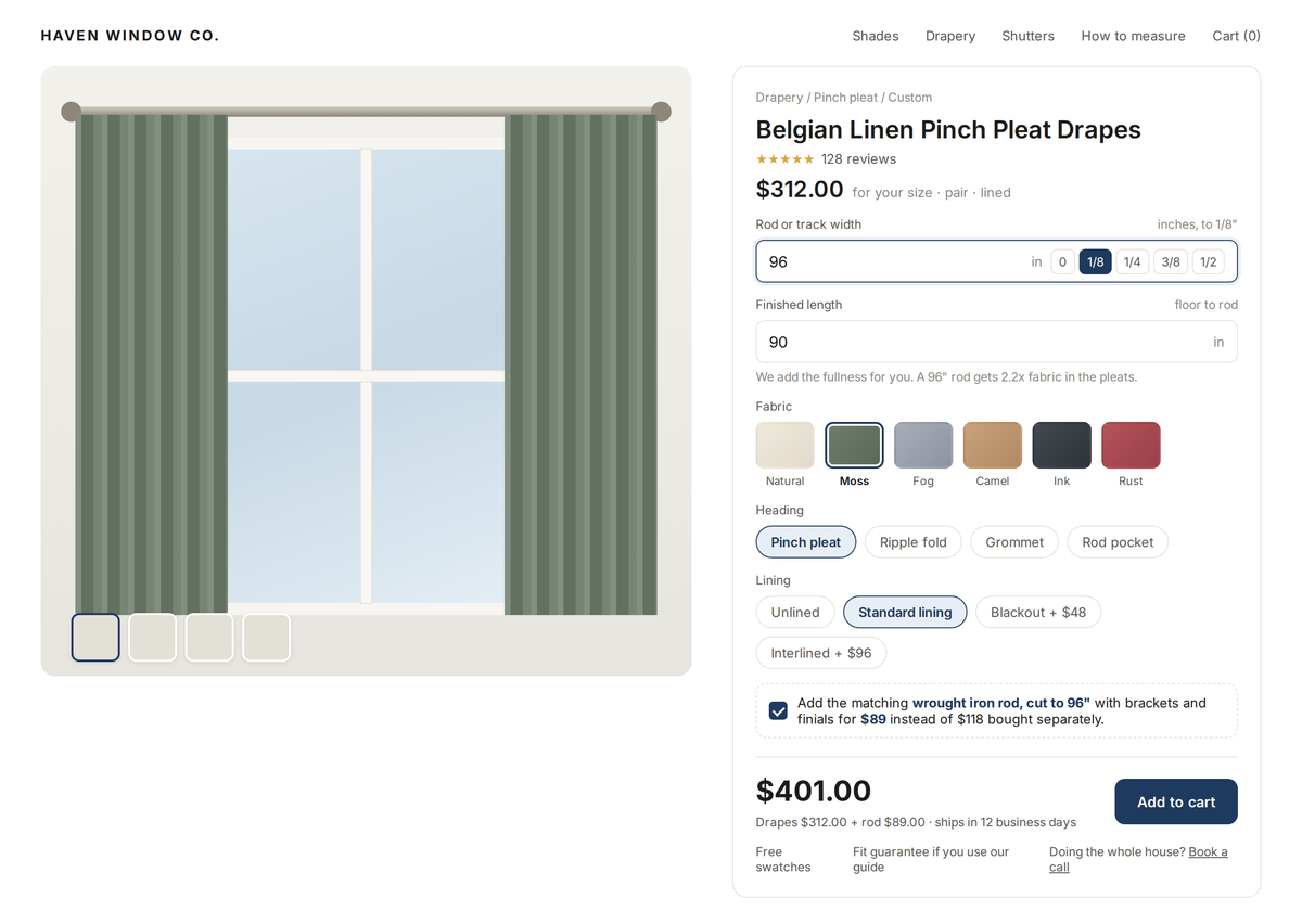
Some stores, and most stores in the United States, want the calculator to sit inside the product page they already have, next to the photos, the reviews and the description, rather than replace it. This layout keeps the classic Shopify product page and puts the calculator in the right hand panel. Measurements are in inches to the nearest eighth, because that is how American customers measure, and the app supports both metric and imperial so the same setup serves a shop in Leeds and a shop in Denver.
The example is a pair of pinch pleat drapes rather than a blind, because curtains are priced differently, by rod width, finished length, fullness, heading and lining, and the calculator handles the arithmetic the customer should never see. The line "we add the fullness for you, a 96 inch rod gets 2.2 times the fabric in the pleats" is there because it is the question every curtain customer asks and almost no website answers. At the bottom is a bundle: the matching rod cut to the same 96 inches, with brackets and finials, for less than the two bought separately. That is where the average order grows without any advertising, and it only works because the rod is priced by length too.
What about on a phone?
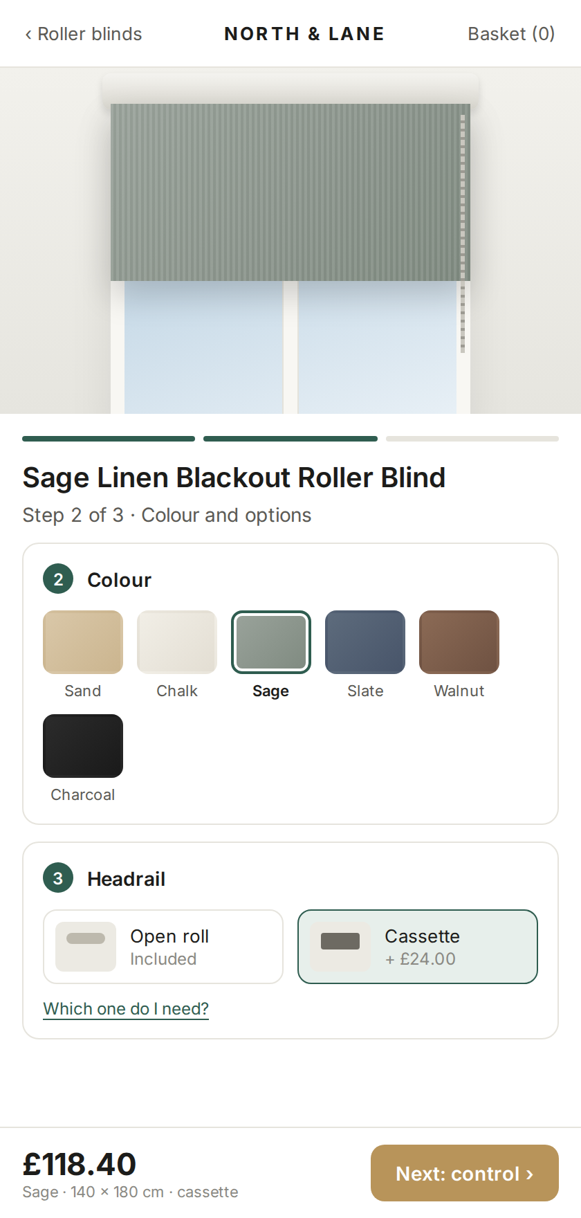
Many of the visitors to a blind store, often most of them, arrive on a phone, and a three column configurator collapsed into a phone screen is where most calculators go wrong. On a phone the calculator becomes one step per screen, with a progress bar at the top and the price pinned to the bottom of the screen at all times, so however far she scrolls the price and the next button are under her thumb. Swatches are big enough to tap, and the options that need explaining, cassette or open roll, get a "which one do I need" link that opens the explanation in place instead of sending her to another page and losing her.
What happens when the customer has twelve windows?
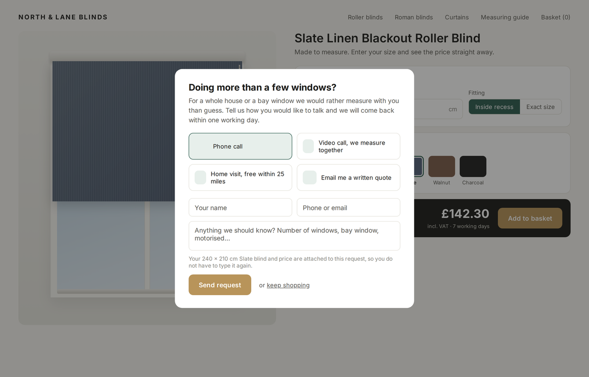
She does not buy on the website, and the calculator should not pretend she will. When the basket grows past a few blinds, or when she clicks "not sure, ask us", a small window opens and asks how she would like to talk: a phone call, a video call where you measure together, a home visit, or a written quote by email. Her size, colour and price travel with the request, so nobody types them twice. In our experience this popup is the part of the calculator that makes retailers money, because a whole house order is worth many single blind orders and it starts with a conversation, not a checkout.
Can the design change without touching the prices?
Yes, and this is the point of separating the two. In Curtain and Blind Calculator the price tables, the options, the rules such as "motor only above 60 cm" and the margins live in the app. The layout on the product page is a skin over that engine. So a retailer can start with style one, build style two for the curtain collection, and try a different order of steps on the mobile version, all without touching a single price. It also means two versions of the same calculator can run side by side and the one that converts better wins. Most retailers have a strong opinion about how their customers buy, and about half of those opinions turn out to be wrong once the numbers are in, so the ability to test cheaply matters more than getting the first design perfect.
What does a custom design cost?
The app itself is $99 a month or $999 a year on the Shopify App Store, with a 7 day free trial, and it comes with a standard layout that works out of the box. A custom user interface like the ones above is a one-off setup: we make a few mockups on the retailer's own product page first, agree the design, then build it. The setup including design is £1,800 ($2,250). The pricing tables, the measuring guides and the contact form are part of that setup, not extras. There is nothing else monthly beyond the app.
Frequently asked questions
Does the calculator work with my existing Shopify theme?
Yes. It runs as an app block inside the product page of any current Shopify theme, so the rest of the store, the photos, reviews and description, stays as it is.
Can customers enter sizes in inches and centimetres?
Yes. The app supports metric and imperial, and the layout can show fractions of an inch for American customers or half centimetres for British ones.
Can I show the measuring guide inside the calculator?
Yes. Measuring and fitting guides, and a form to ask a question or request a written quote, sit inside the calculator so the customer never has to leave the product page.
Can I test two designs at the same time?
Yes. The prices and rules live in the app, the layout is a skin over them, so two layouts can run on the same pricing and you keep the one that converts.
How long does a custom layout take?
Mockups first, usually within a week of getting your product list and price lists, then the build once the design is agreed. The price lists are what take the time, not the design.
More on how the pricing behind these layouts works is on the Curtain & Blind Calculator page, where a new piece goes up every day.
If you sell blinds online today, which of the three layouts is closest to your product page, and which one would your customer rather use?
1reading now
Get an email when Curtain publishes